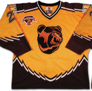
I watch a lot of hockey and almost as much Project Runway. There is something to be said for style, for being on the cutting edge, and for pushing the boundaries. On the other hand, style has to be appropriate to its intended context, and in the testosterone-fueled world of contact sports that means design choices should adhere to some loose guidelines. Simple, classic, easily identifiable, appealing, and preferably a little bit tough. There is a reason there is no hockey team named the Silly Bunnies. It's all "Rangers" and "Flyers" for a reason. One should…you know…look like a group of professional athletes to be taken seriously. Even if, as is the case with the Rangers, you aren't.
Assuming that most of you don't care about hockey, let me assure you that you can still enjoy this post as long as you enjoy one of the five pillars of the Ginandtacos experience: posting pictures of things and proceeding to make fun of them a lot. So, in no particular order, here is Epic Fail: the Logo Edition.
1. 1996-1998 New York Islanders
Are you intimidated by the Gorton's fish sticks logo?
If so, you will shit your pants at the thought of playing the late '90s Islanders. You will find their logo positively terrifying. Ahoy, matey! Thar she blows. And by "she" I mean the New York Islanders.
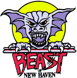
2. New Haven Beast
The minor leagues are a great place to find both the best and worst of logo design. Can you guess which one this is?
This looks like they had a contest to let fans design the logo, but with some important caveats. The contest was open only to children aged 6 to 10 with profound emotional disabilities. And the prize money was only $4, so even most of the disturbed kids didn't bother entering a drawing.
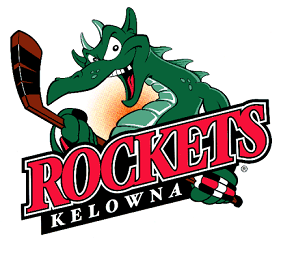
3. Kelowna Rockets
Not pictured: A FUCKING ROCKET. This is like a t-shirt bearing the image of the British flag with "SPAIN" written underneath it.
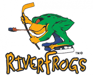
4. Louisville River Frogs
There is so much wrong with this.
Start with the frog squatting as though it is trying to use a particularly filthy gas station toilet without making contact with the seat (I call this "Hover Modetm"). Then add Comic Tard font. Then have the anthropomorphic frog tonguing the puck, which, if not a 2-minute minor penalty, is at least frowned upon for sanitary reasons. This all overlooks the more obvious question of why anyone would name a hockey team the "River Frogs." Don't frogs live in ponds?
5. California Golden Seals
The NHL's first attempt at planting a flag in California was the California/Oakland Golden Seals (also the California Seals for a while) produced an artistic palette that practically shouted "It is 1973 and I do tambourines full of coke every night." The regrettable color scheme (check out the full uni – holy shit!), the Art Deco seal, and the inescapable fact that the seal is nature's comedian doom this logo from the outset. Fortunately the idea of having a shapeless blob for a logo died here…
6. Buffalo Sabres, current
Goddammit. Were you not listening, Buffalo? This is popularly known as the "Buffaslug", a horned invertebrate native to upstate New York. They went from one of the most bad-assed (if overly literal) logos in sports to this monstrosity, the love child of a flaccid hot dog and the American bison. For shame.
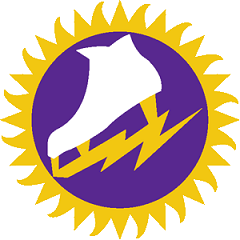
7. New York Raiders (WHA)
Ahem.
First of all, the team appears to have gotten a stock logo, perhaps from clip art, that has absolutely nothing to do with the team name. Second, the logo appears to have been copied from a competitive men's figure skating team. The Raiders were horrible, but at least they looked faaaaaaaaaaaaabulous.
8. Anaheim Mighty Ducks, "Wild Wing."
Can you believe professional athletes – adults, not children – walked out of a locker room with this on their chests? On purple and teal uniforms, no less? The indignity of playing for a team named after a Disney kids' movie wasn't soul-crushing enough, I suppose, so the owners (shockingly, Disney) piled it on. Unanswered, of course, is the question of how Wild Wing was able to breathe under the ice.
9. Boston Bruins alternate/historic logo
Hey look everyone! It's Gentle Ben!
Look at the look on that bear's face. He looks bemused. Puzzled. Perhaps interested in having a tasty treat from a picnic basket. Apparently back in the day when this logo was devised they figured any ol' bear would do. "The team is called the Bruins. Just draw a bear and let's go to a vaudeville show!" Most people would still be afraid if confronted by this bear, but it looks far more likely to lick you than to tear you limb from limb. These jerseys make me want to scratch Poopsie the Bear (or whatever the hell his name is) behind the ear and ask him if he is a good boy.


